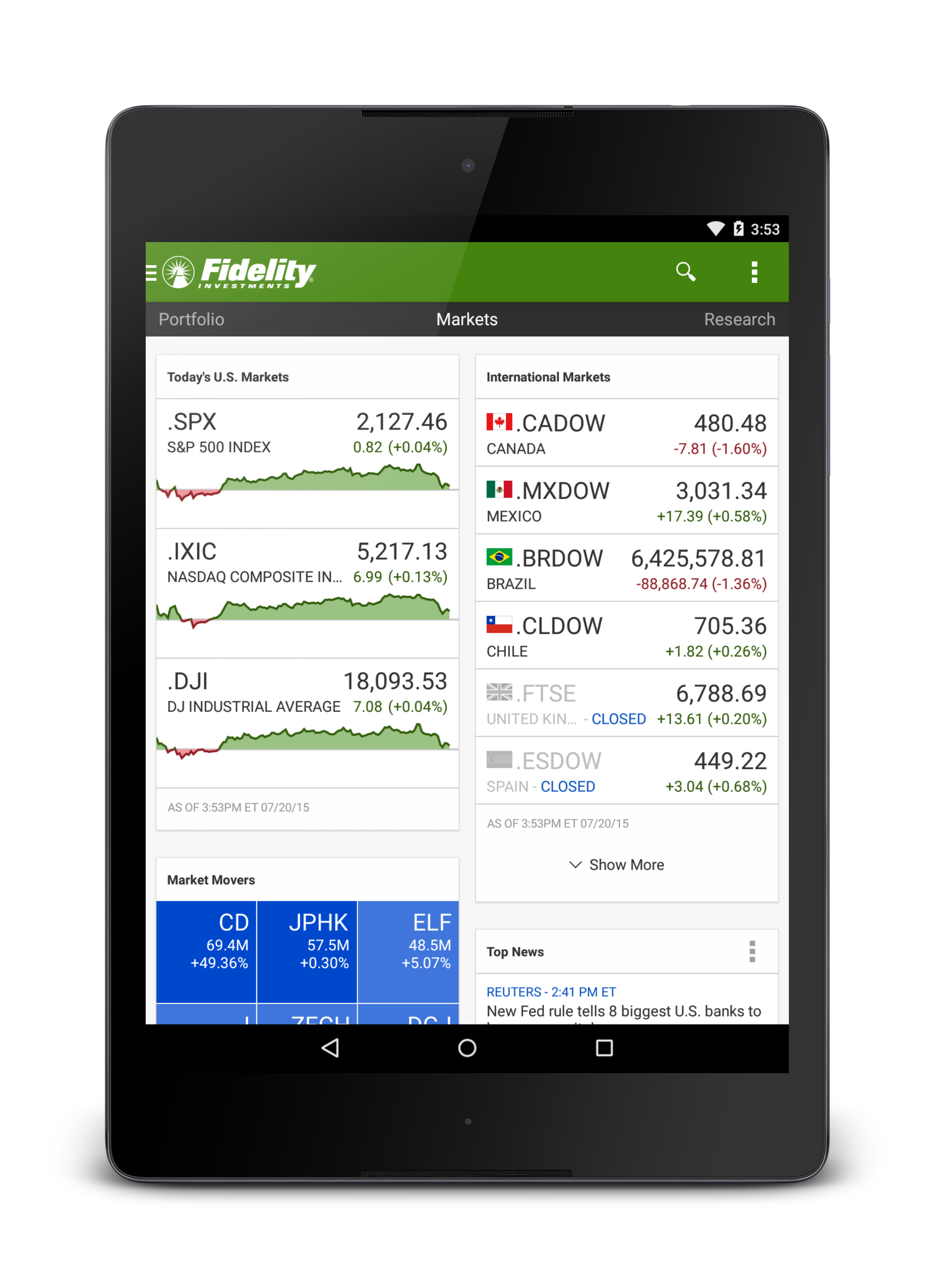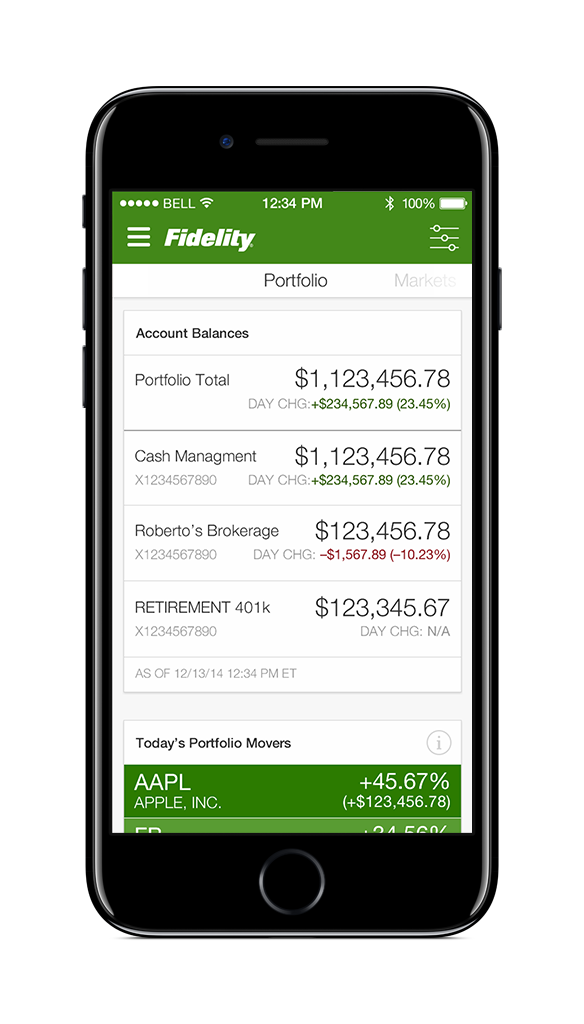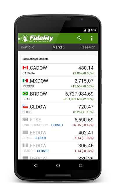
Mock-up showing the completed home stacks across all three categories
Fidelity mobile homescreen redesign
Late 2013 – Early 2014
Challenge
When the smartphone app was redesigned in early 2013, its homescreen featured a series of cards in a carousel framework. The card content featured a range of topics including market trends, recent quotes and customer’s account information. It quickly became apparent that the framework could not accommodate the range of topics the product owners wished to introduce in future releases. The design team was tasked with reworking the layout to incorporate the current content as well as future plans.
Solution
Customer feedback on the existing structure heavily informed the redesign. The carousel format was removed in favor of three stacks of cards organized in stacks. The themed stacks separated important customer information from more generic market and research content. A dedicated settings panel was introduced to allow customers to completely customize their app homescreen, turning cards on or off and reprioritizing items to the top of the stack.
Benefits
The customer feedback was largely positive following the updates. The stacked format made it easier to add additional content cards, while the themes provided some structure for what that content could be. On the Android platform, the cards adapted to the larger screen sizes in a tiled approach.

